Friday, 6 May 2011
Link to Evaluation PowerPoint
https://docs.google.com/present/edit?id=0AZXNf1y-IrHYZGYydzRucjhfMGY3NTNnOWRk&hl=en&authkey=CJz2veAG

Thursday, 14 April 2011



Point By Point of Final Draft Production
-After hearing bad feedback for all three rough cuts, decided to start from scratch.
-Front cover of Mixmag issue 223 used as style model, text created to fit into exact scheme of layout, colour scheme copied and old, unacceptable photo of self used until suitable substitiute found.
-Took photos of various models, including Jack Davison and Benji, assuming they would act as the model on the front cover (though later it would turn out that scheduling conflicts would prevent this).
-Learned about Leading and the Baseline Shift function, used it to move the two words in the title closer together to better simulate a title. Also created a barcode by creating a straight line with the Marquee function, and adding noise from the Filter menu. Was made Gaussian and Monochromatic, making black and white lines of varying thickness. A splash effect was made by creating a circle in the Shape Tool, and then applying the ripple function to it to make it appear as though it were a puddle.
-Layout of contents page created, based on contents page from Tilt Magazine, Issue Unknown. Text layout, positioning of background boxes and banners all copied directly from style model. Photos not yet taken at this stage. Orange bars around text boxes created with the Stroke Tool, which creates a colour bar around a designated object.
-After series of complications surrounding photographing other models, I eventually settled on my model, visiting his house and a recording studio to take photos for the Front Cover, Contents Page and Double Page Spread.
-Using the Mac's Aperture programme, all images were "auto-enhanced" to remove extremely dark shadows. I also took photos of my sister for the contents page and front cover, and intentionally very surreal, indescernable photo of a club scene, for the contents page.
-Photo of decided upon model for the contents page was cut out using the Magic Wand tool and the SHIFT button, allowing me to get rid of large amount of the background. Vital as he was standing in front of a brick wall. Now that I had a definite model, I changed the story from the previous "Celebrity DJs" story to one about the particular DJ on the front, after realizing it was too close to the style model's story. I also typed up an interview with the DJ in a word processing programme before adding it to the double page spread later
-After photos were decided upon, a layout was determined, vaguely based on the Tilt contents page. Instead of four images however, I only used three, as I couldn't use any more without reusing a subject. Instead of the stroke tool, I simply used rectangles made in the Shapes Tool.
-Style model of Double Page Spread was a spread from Mixmag issue 239 about a band named Wolf + Lamb. After hearing that certain features of the spread copied from the magazine weren't conventional (white boxes around the text, and image crossing the page boundaries), I instead moved the text to one page, greatly extended the interview I had typed up, and shrunk both images I had made before moving both images to the other page.
-Front cover of Mixmag issue 223 used as style model, text created to fit into exact scheme of layout, colour scheme copied and old, unacceptable photo of self used until suitable substitiute found.
-Took photos of various models, including Jack Davison and Benji, assuming they would act as the model on the front cover (though later it would turn out that scheduling conflicts would prevent this).
-Learned about Leading and the Baseline Shift function, used it to move the two words in the title closer together to better simulate a title. Also created a barcode by creating a straight line with the Marquee function, and adding noise from the Filter menu. Was made Gaussian and Monochromatic, making black and white lines of varying thickness. A splash effect was made by creating a circle in the Shape Tool, and then applying the ripple function to it to make it appear as though it were a puddle.
-Layout of contents page created, based on contents page from Tilt Magazine, Issue Unknown. Text layout, positioning of background boxes and banners all copied directly from style model. Photos not yet taken at this stage. Orange bars around text boxes created with the Stroke Tool, which creates a colour bar around a designated object.
-After series of complications surrounding photographing other models, I eventually settled on my model, visiting his house and a recording studio to take photos for the Front Cover, Contents Page and Double Page Spread.
-Using the Mac's Aperture programme, all images were "auto-enhanced" to remove extremely dark shadows. I also took photos of my sister for the contents page and front cover, and intentionally very surreal, indescernable photo of a club scene, for the contents page.
-Photo of decided upon model for the contents page was cut out using the Magic Wand tool and the SHIFT button, allowing me to get rid of large amount of the background. Vital as he was standing in front of a brick wall. Now that I had a definite model, I changed the story from the previous "Celebrity DJs" story to one about the particular DJ on the front, after realizing it was too close to the style model's story. I also typed up an interview with the DJ in a word processing programme before adding it to the double page spread later
-After photos were decided upon, a layout was determined, vaguely based on the Tilt contents page. Instead of four images however, I only used three, as I couldn't use any more without reusing a subject. Instead of the stroke tool, I simply used rectangles made in the Shapes Tool.
-Style model of Double Page Spread was a spread from Mixmag issue 239 about a band named Wolf + Lamb. After hearing that certain features of the spread copied from the magazine weren't conventional (white boxes around the text, and image crossing the page boundaries), I instead moved the text to one page, greatly extended the interview I had typed up, and shrunk both images I had made before moving both images to the other page.


Audience Research Charts & Analysis


In the above 7 charts, I performed audience research amongst 8 different people in order to ascertain what features to imbue my magazine with. As 6 out of 8 were male, and 5 out of 8 between the ages of 16 and 25, I shall feature a person of that age on the front cover to relate with the target audience. 4 out of 8 say they would expect to pay between £3.00 and £3.99 for a magazine, and so I shall charge £3.99 so as to maintain an economic price and also still turn a profit from the magazine. 6 out of 8 claim to already subscribe to 3-4 magazines on a monthly basis, another reason to price my magazine economically as they are already spending money on other magazines. 4 out of 8 people also claim their favourite genre of music to be trance, and so I shall make my magazine about trance music. 6 out 8 claim that they purchase magazines mostly for the interviews, and all 8 claim that their favourite colour is orange. Therefore, I will have the front cover be about an interview, and contain mostly the colour orange.
Monday, 11 April 2011


Sunday, 10 April 2011
Diary Entry for April 10th.
Today I have produced a final, or near final draft of all three aspects of the magazine, cover, contents and double page spread.
At approximately 10 am, I took photos of a model outdoors in order to indicate an outdoor festival scene. I then used enhancing techniques in the Mac program Aperture in order to remove dark shadows.
Photos of the model I took yesterday and on Friday were added to the front cover and contents, replacing my previous model. I also changed the colour scheme of the front cover to orange and black, so as to contrast with the blue clothing he was wearing. This consistency is seen in my contents page, also using an orange and black colour scheme inspired by the contents page of the magazine Tilt.
The orange borders around the images in my contents page were achieved by making an orange box in the shapes tool and placing it behind the image in question. As it would not let me transfer the colour of the text from the title to the box with the eye-dropper, I had to instead copy out the RGB colour coordinates of the title and use them to alter the colour of the boxes. To fully assimilate the layout of the magazine cover into my own, I placed the page number of the advertised feature in the corner of the boxes. I also had to retype the contents page of the magazine, in order to properly reflect the page layout found in an actual magazine.
I have saved four copies of each component of the magazine, two .jpgs and two .psds, on the computer for backup and on my memory stick respectively. The PSDs are for in case I need to make any last-minute adjustments or edits before the deadline, the JPGs having been created from a flattened version of the photoshop files, in case it turns out I have no need to edit them further. I have also produced A4 prints of the files, to demonstrate what it is they will look like once printed. Over the remaining four days I have, I intend to redo my audience research and analysis, along with accompanying videos of a certain few fellow media students, which will be done at lunchtimes as I live far away enough from most of them that it would be of some inconvenience to them to do the videos at home. I will also finally upload my Initial Ideas Sketch as, though I had intended to upload it prior, technical issues prevented me. I now have a functioning scan of it however, and so nothing can prevent me.
At approximately 10 am, I took photos of a model outdoors in order to indicate an outdoor festival scene. I then used enhancing techniques in the Mac program Aperture in order to remove dark shadows.
Photos of the model I took yesterday and on Friday were added to the front cover and contents, replacing my previous model. I also changed the colour scheme of the front cover to orange and black, so as to contrast with the blue clothing he was wearing. This consistency is seen in my contents page, also using an orange and black colour scheme inspired by the contents page of the magazine Tilt.
The orange borders around the images in my contents page were achieved by making an orange box in the shapes tool and placing it behind the image in question. As it would not let me transfer the colour of the text from the title to the box with the eye-dropper, I had to instead copy out the RGB colour coordinates of the title and use them to alter the colour of the boxes. To fully assimilate the layout of the magazine cover into my own, I placed the page number of the advertised feature in the corner of the boxes. I also had to retype the contents page of the magazine, in order to properly reflect the page layout found in an actual magazine.
I have saved four copies of each component of the magazine, two .jpgs and two .psds, on the computer for backup and on my memory stick respectively. The PSDs are for in case I need to make any last-minute adjustments or edits before the deadline, the JPGs having been created from a flattened version of the photoshop files, in case it turns out I have no need to edit them further. I have also produced A4 prints of the files, to demonstrate what it is they will look like once printed. Over the remaining four days I have, I intend to redo my audience research and analysis, along with accompanying videos of a certain few fellow media students, which will be done at lunchtimes as I live far away enough from most of them that it would be of some inconvenience to them to do the videos at home. I will also finally upload my Initial Ideas Sketch as, though I had intended to upload it prior, technical issues prevented me. I now have a functioning scan of it however, and so nothing can prevent me.
Saturday, 9 April 2011
Diary Entry of Events Before April 9th
In the run up to April 4th, I produced an updated version of my front cover, after having recieved mostly negative feedback concerning my previous attempt. I followed a style model (Issue 223 of Mixmag "Why Celebrity DJs Must Be Stopped", seen in a previous cover analysis entry.), imitating the text layout and colour of the magazine. I have by this point taken front cover pictures of three different models, having to ignore all but one as actually contacting them or making them available proved impossible, and I had to abandon the previous photo of myself as I need to be able to prove that I am the one who took the photos, and I am apparently not believable as a DJ. All that remains now is to take some photos of another model for my contents page.
Diary Entry for April 9th
Today, I was able to find a new model for the front cover, double page spread and contents page of the magazine.
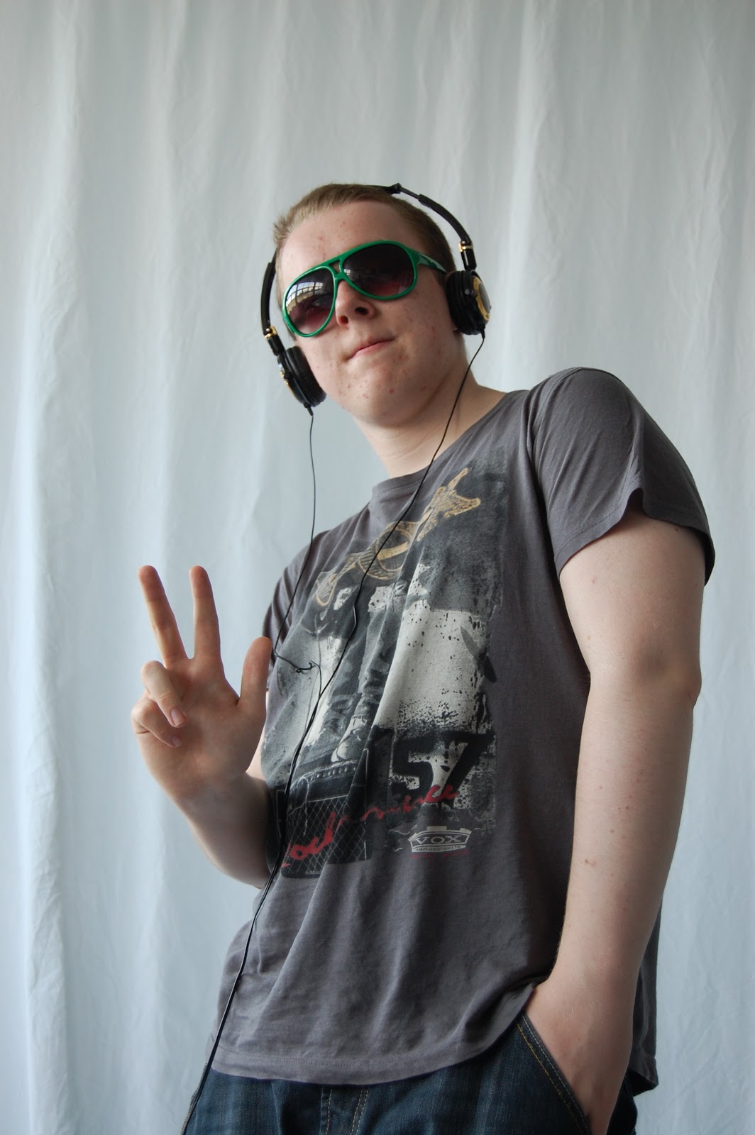
I took photos of the subject, posing as though he were a DJ in a recording studio, making use of many of the props on hand to add to the subject's traits of apparent arrogance and wealth.
I then also went around to his house where he had set up a DJ-esque turntable, and I had brought some glow-in-the-dark rave bangles for him to wear around his wrists with. I took photos from a multitude of angles, including close-ups of his hands and low angle shots. I have not yet determined where on my magazine these will go, though most probably the contents page.
I have also produced a near-final version of my double page spread, using images of the model from the shoot at the recording studio, and using a double page spread from a recent issue of Mixmag as a style model.
I took photos of the subject, posing as though he were a DJ in a recording studio, making use of many of the props on hand to add to the subject's traits of apparent arrogance and wealth.
I then also went around to his house where he had set up a DJ-esque turntable, and I had brought some glow-in-the-dark rave bangles for him to wear around his wrists with. I took photos from a multitude of angles, including close-ups of his hands and low angle shots. I have not yet determined where on my magazine these will go, though most probably the contents page.
I have also produced a near-final version of my double page spread, using images of the model from the shoot at the recording studio, and using a double page spread from a recent issue of Mixmag as a style model.
Monday, 28 March 2011
Audience Research Text
Audience Research Redux
1. Please describe the average attire of a club goer.
2. What colour scheme would one usually associate with clubs?
3. What are the major issues in clubbing today?
4. How much roughly would you expect to pay for a magazine?
5. What part of a magazine is the main incentive for you to buy it?
6. Do you like to read
A: Interviews with up and coming DJs
B: Features on major issues in clubbing today
C: Q&A Interviews
7: What age range do you think are interested in clubbing?
8: What icons or motifs do you associate with clubbing?

Sunday, 27 March 2011
Creation Process of Magazine Cover, Contents and DPS
In the creation of my magazine, I employed the use of programmes other than Photoshop, such as Adobe Illustrator, as it is far more efficient for magazine production. I then exported it as a PhotoShop file. I often adjusted the transparency of objects, and used transparency effects such as Burn and Darken to achieve effects such as the semi-transparent spiral on the contents page. I also took great care to align the text boxes and images on the page to eachother, to maintain some semblance of symmetricality.
The text boxes were generated with the shape tool,, and then made transparent so that the image behind it would be still partially visible.
The text boxes were generated with the shape tool,, and then made transparent so that the image behind it would be still partially visible.
Friday, 25 March 2011


Monday, 21 March 2011
Mixmag Cover Analysis 2

Diary Entry 4 (actually current)
I have finally uploaded all of my magazine analysis, as well as some of my audience research, although I am unable to upload the videos at the moment. I intend to rectify this at a later date. I will also continue to work on my rought cut of my magazine while at home, taking photos and retroactively improving my prior blog entries, in particular I intend to scan in the various covers and double page spreads that I have analyzed, though have not yet found images of online.
Saturday, 19 March 2011
Diary Entry
Today I produced a rough cut of the front cover of my magazine. I have made some signifigant changes since the last iteration, including differences in the title and overall layout.
I also learned about various graphic design tropes, in particular avoiding making the text too close to the edges of the pages.
I also learned about various graphic design tropes, in particular avoiding making the text too close to the edges of the pages.
Subscribe to:
Posts (Atom)